The first feature of a good and effective logo is that it can immediately grab viewer’s attention. The logo should have an immediate impact and hold the viewer’s attention.
For example :
However, if the logo did manage to catch the viewer’s eye, that doesn't necessary mean we are doing good. There might be a hidden ''connotation'' that you cannot see at first sight.
Here the example of Worst Logo Fails of all time which probably didn't look so bad at first sight.
This is an actual logo designed in 1973 for the Catholic Church’s Archdiocesan Youth Commission. It even won an award from the Art Directors Club of Los Angeles.
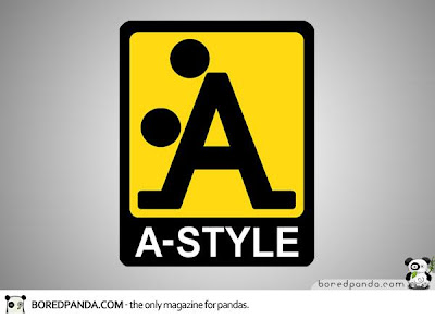
'A-Style' logo was born well before the line of clothing – designed in 1989 and marketed in Italy since 1999. It was in fact an invention of his creator who began to attack Italian cities with stickers on a yellow background with A-Style logo followed by other cities including Miami , Moscow and London. The newspapers and television began to be interested in the strange appearances of the logo, and soon the company started marketing their products under the brand A-Style.
Besides 'A', you will see another meaning of this symbol. - IF YOU KNOW WHAT I MEAN
 The Office of Government Commerce (OGC) is an independent Office of the Treasury. Sometimes you need to shift your view to realize the error.
Emm....I wonder how the mouse look like
Now you know why Mr. Satellite looks so happy.
Look at that ASS
Body or dancing??
ARHH.... what a good position...


No comments:
Post a Comment